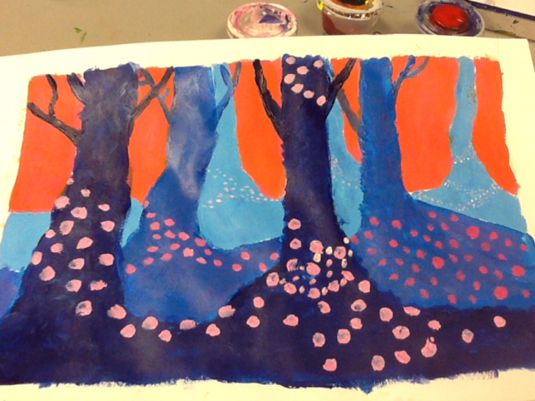
For the spooky trees I used acrylic paint in order to show the clearly vivid colors of the blue and pink. The art elements I used were line, value, shape, color, and texture of the trees. The design elements I used were pattern and emphasis: the constraint of the colors of the dots versus the dark colors of the trees. I ended up liking this project, even though I didn't completely finish on time.
The media I utilized while completing this project included special ink, and the linoleum block. The art elements that are the most prevalent are shape, space, and color; because of my use of ink to show the color. The design elements that I see in my artwork include contrast and emphasis; in that all the colored parts of these pieces have emphasis placed on them. I really love these pieces because of how they remind me of my grandmother; who always loved colorful butterflies like these. Just like the matted project above, the black and white print uses the same media, and lots of shape and value for its art elements. This also includes Design elements such as emphasis and a slight pattern because of the use of the cross hatching pattern to shade and create value. This project was especially fun because of the way I got to learn how to properly shave the linoleum blocks, creating an awesome print. This dreamtime project used media such as acrylic paint, pencils, and paper. The art elements used were line, shape, and color. The design elements were movement, contrast, and harmony with the rainbow of colors. This dreamtime was really important to me because it represents my rainbow of emotions when competing in gymnastics, and all my fears are in this painting , represented by the wobbly beams, the stress to win, etc. For my independent project, the media I used were colored pencils and regular pencil on paper. The art elements demonstrated in my tri-apple drawing include depth, lines, and shapes. As well as some important design elements such as emphasis and scale. I really liked redoing this project because I believe I executed it much better this time. The media I utilized while completing this project included special ink, and the linoleum block. The art elements that are the most prevalent are shape, space, and color; because of my use of ink to show the color. The design elements that I see in my artwork include contrast and emphasis; in that all the colored parts of these pieces have emphasis placed on them. I really love these pieces because of how they remind me of my grandmother; who always loved colorful butterflies like these. Just like the matted project above, the black and white print uses the same media, and lots of shape and value for its art elements. This also includes Design elements such as emphasis and a slight pattern because of the use of the cross hatching pattern to shade and create value. This project was especially fun because of the way I got to learn how to properly shave the linoleum blocks, creating an awesome print. The media I used for this project was black ink and a calligraphy pen. I also ultilized value, shape, and shape as my art elements; these helped me to distinguish the shapes. The design elements protrayed in this drawing are contrast and pattern. I really liked this drawing because butterflies remind me of my grandma, and how she loved collecting their wings, and drawing them. The media I used for this project is watercolor paints, pencils, and fairly thick paper. Value was pretty important in this project, otherwise, you wouldn't be able to see shadows or highlights. The art elements used were line, shape, space, and color. The design elements that I utilized in this painting were movement, pattern, and emphasis- especially near the front of the painting with the very dark brown lines. This drawing was important to me because it was one of my favorite places in Yellowstone; I absolutely love it. For this project, we had to create 3 faces at different angles using paint and very thick paper. The art elements used were lines in the actual sketch, value, like for shadowing and highlighting, and space/depth so that my face looks 3-D. The design elements used were contrast, like in my shirt and background. And also, I used scale, so that my face looks more realistic. This drawing was important to me because it's really vital to know what your own face looks like, and it's an important scale. For the face painting project, I worked with watercolor paints and pencil for my media. For my art elements, I used lines in my face sketch, value to shade, and form, to make my face look 3-d. Contrast, emphasis, and proportion were all also very important to this face painting, as design elements, they brought out my painting to make it look much more realistic. This was an important project to me because learning to paint and draw faces is an important life skill, say, if you needed to identify someone but didn't know their name. The media I used for this project was the act same as the front-facing drawing, a pencil, eraser, and paper. I used line,value, shape, and form as art elements. As for design elements, I used contrast, scale, and emphasis. I liked this project because it was really hard trying to get the proportions right. |
AuthorWrite something about yourself. No need to be fancy, just an overview. Archives
January 2016
Categories |